
A multi-year systems rebuild for Liu Shiming Art Foundation — website, modular CMS, design system, and cross-platform publishing workflows that let a small team show up consistently across web, email, and social.
Rebuilding a content-driven digital ecosystem for an international art foundation.
Role
UX/UI · IA · Design System · CMS · Content Strategy
Timeline
2023 — Present
Ongoing in-house
Deliverables
Responsive web · Modular CMS · Cross-platform templates · Design guidelines
Live
lsmartfund.org
@lsmartfund
What this is.
the company's content was scattered across one-off pages. There were no shared templates, no system to anchor consistency, no workflow to coordinate releases. Every new program meant rebuilding from near zero.
This case is the story of replacing all of that — with a website, a modular CMS, a design system, and a unified publishing workflow that scales with the foundation instead of breaking with it.

Three problems, one root cause.
The visible issues were everywhere — inconsistent pages, slow releases, fragmented social. The root was the same: there was no underlying system.
Fragmented architecture
Exhibitions, archives, and public programs lived in separate structures. Nothing shared logic. Cross-discovery was nearly impossible.
No system, no scale
Every page, email, and social asset was built individually. No tokens, no components, no patterns to anchor decisions.
Disconnected channels
Web, email, and social ran as parallel production lines. Output didn't compound — each release started near zero.
A system, not a redesign.
The work was organized around three pillars. Each had its own output and its own logic — but together they form one connected system.
Rebuilt around how content actually moves.
New site architecture and modular CMS structure built around the foundation's real content types — exhibitions, archives, programs, ongoing publications. Pages compose from shared logic, not from
one-off layouts.

One source of truth, across web, email, and content.
Tokens, components, patterns, and documentation in a single library. Newsletter typography inherits from the same place as website headlines. The system is the foundation; the surfaces inherit from it.
Unified workflows across every channel.
Web, email, and social publish from shared content structures. A single program release triggers consistent output across five surfaces — no separate production cycles.

A six-step rhythm, from brief to release.
A shared operational structure keeps exhibitions, campaigns, and publications aligned across platforms and production cycles. It lets a small team deliver consistent, scalable output over time.
Content intake
Programs and publications enter through a shared content structure.
Modular planning
Existing systems and reusable blocks reduce repetitive production work.
Publishing framework
Layouts, templates, and asset structures adapt across channels.
Multi-platform rollout
Web, email, print, and social launch through one coordinated workflow.
Iteration & maintenance
Systems update continuously instead of rebuilding every cycle.
Review & alignment
Outputs stay visually and structurally consistent across teams.
Same content. Different infrastructure.
The most visible change is on the page. The deeper one is underneath.
Before

After

Where the work happened.
Four decisions shaped the final system. None of them were obvious at the time.
Modular blocks, not fixed templates.
Fixed templates would have broken within months. The foundation publishes too many formats — exhibitions, archives, news, retrospectives, ongoing programs — for a single layout to hold. Modular content blocks compose into any page type and survive new formats without redesign.
One library across web, email, and content.
Most organizations run separate systems for marketing email, web, and social. That guarantees inconsistency. The design system covers all three from a single library — same tokens, same components, same patterns. A newsletter inherits typography from the same place as a website headline.
Structure before surface.
Visual decisions came after IA, content models, and component architecture were locked. Surface design inherited from structure, not the other way around. Most rebuilds invert this order and end up with beautiful pages that don't scale.
A system that updates, not one that gets rebuilt.
Foundations operate with small teams and ongoing programs. The "redesign every three years" model wastes effort. This system is built to absorb updates continuously — patterns refine, components add, but the foundation itself stays in place.
What the system produced.
Numbers from approximately one year of operation under the new system.
Website traffic
5x
Monthly visits grew from ~200 to 1,000+
Social media
6.2x
Organic follower growth from ~1k to 6.2k+, ~1 year
Production time
−50%
Across web, email, and content, after design system rollout

Website
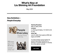
Newsletter

Social Media

Event Campation

Catalog & Archive
The work that matters most isn't visible in any single page or asset. It's in the infrastructure underneath — the modular CMS, the design system, the publishing workflows — that lets a small team show up consistently across every channel the foundation touches.
The foundation publishes faster, with less effort, and with output that compounds.


